
Nursery in a Box
The Client & Challenge
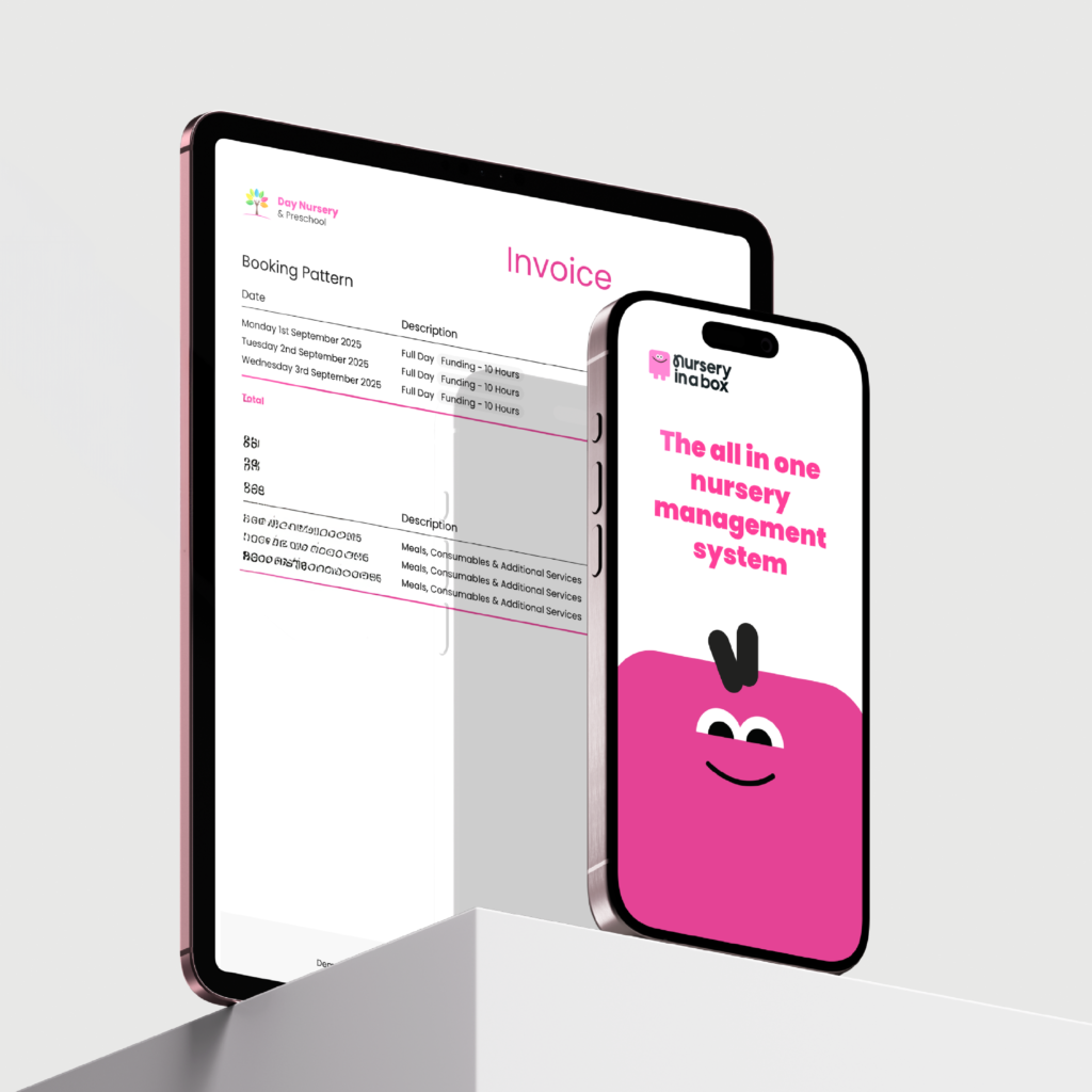
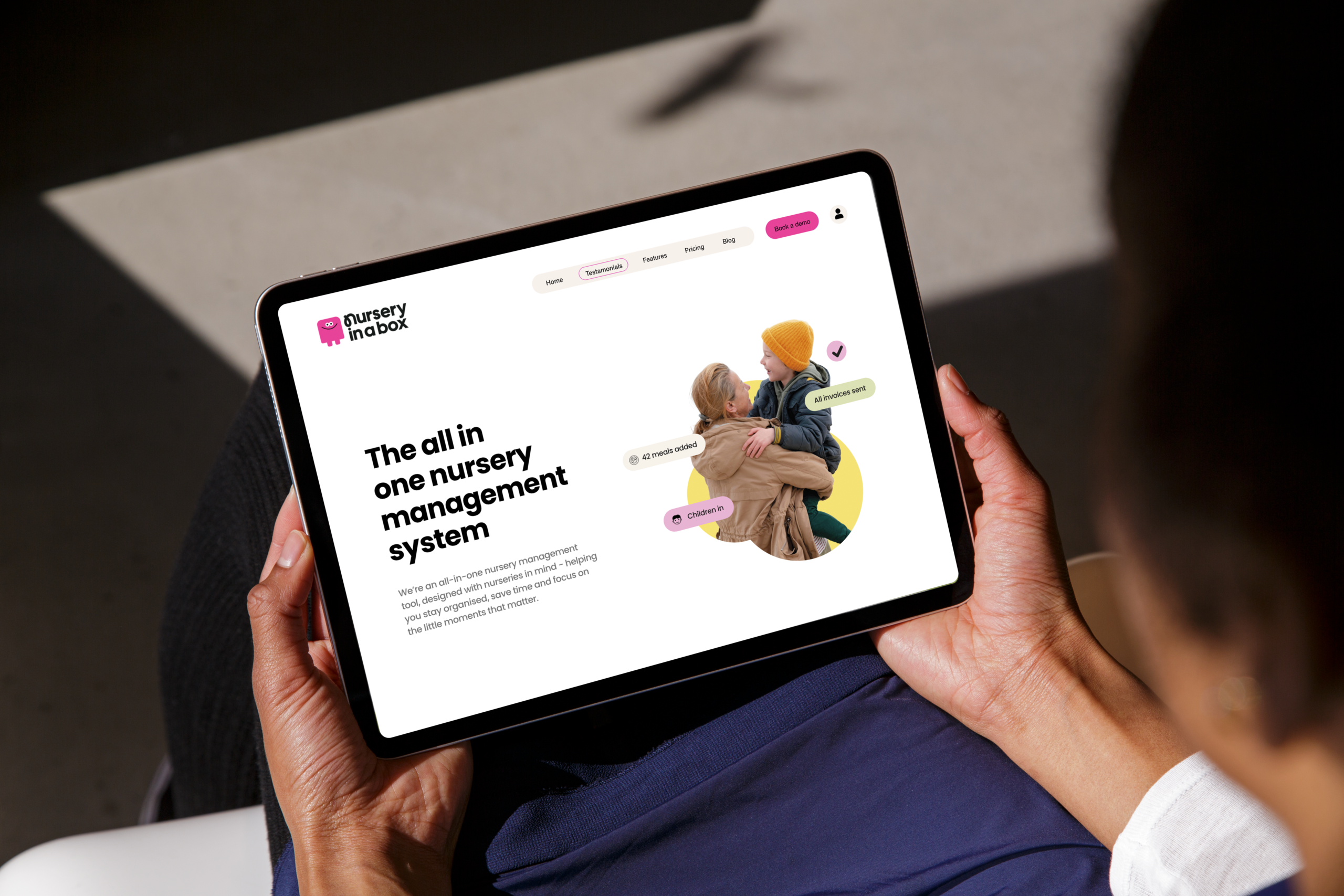
Nursery in a Box, is an all-in-one management platform that fundamentally solves the operational chaos plaguing childcare providers. Their software is robust, offering streamlined features for invoicing, communication, and scheduling. However, the existing brand identity was generic and corporate, creating a significant psychological barrier to adoption. Our research showed that nursery managers and educators, who value nurturing and connection, often feel overwhelmed by the idea of implementing new technology. The old, cold brand failed to communicate the core promise of Simplicity and Empathy, making the software look complex and intimidating. Our aim was to transform the visual identity to reassure users that this tool was friendly, intuitive, and built by people who genuinely understood their world.

The Strategy
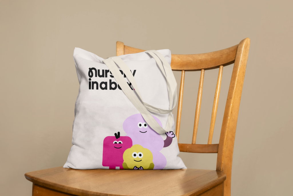
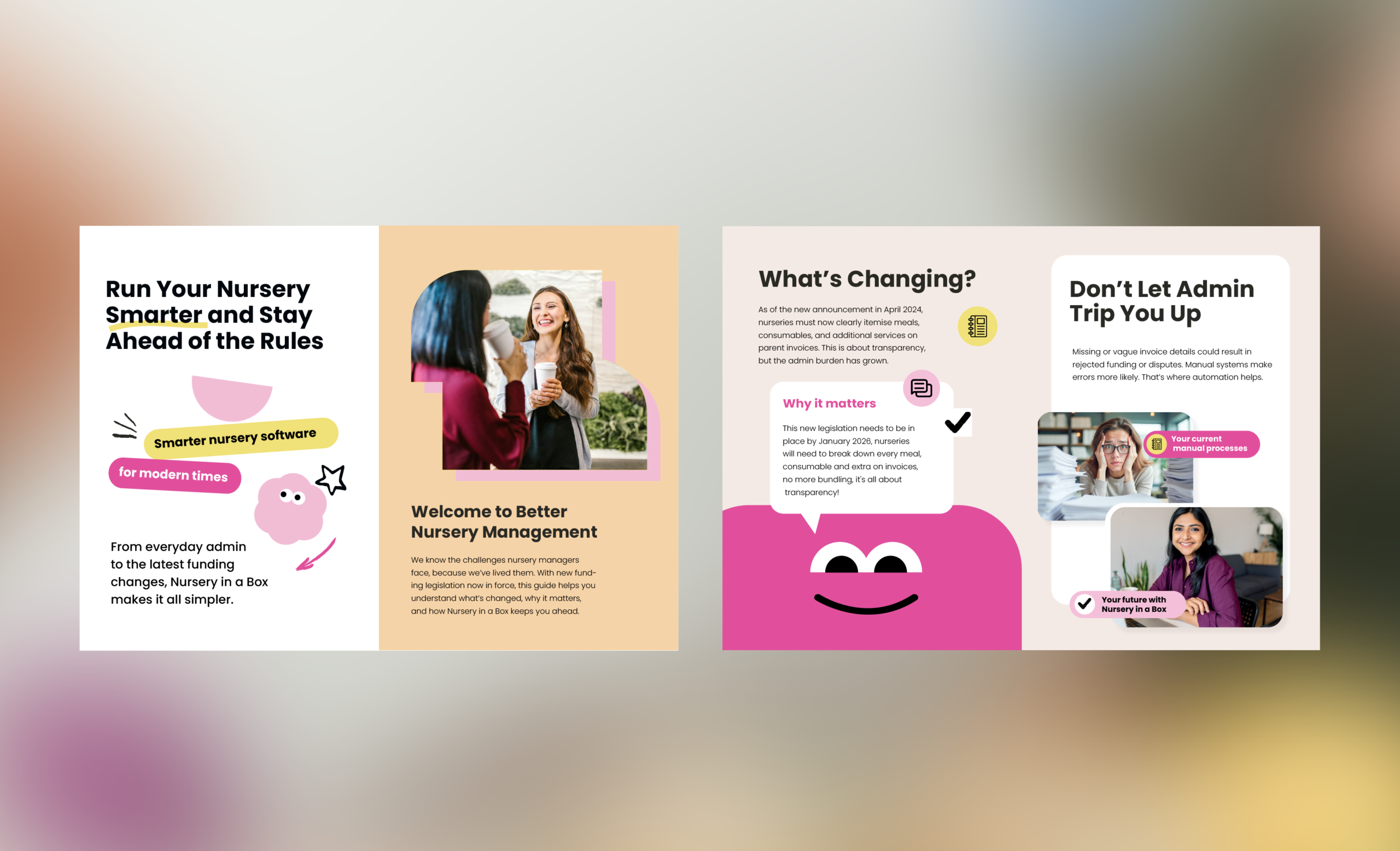
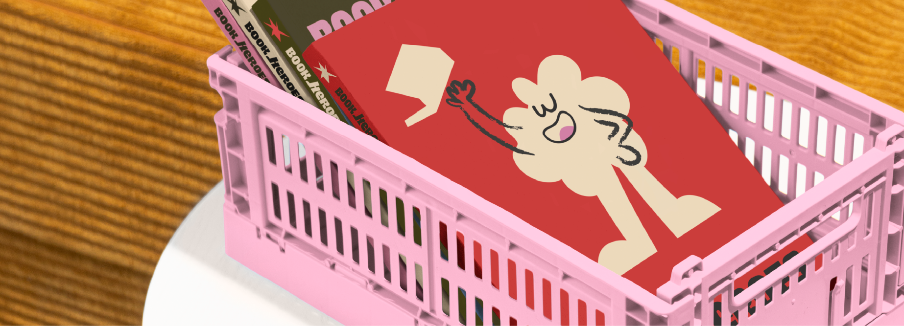
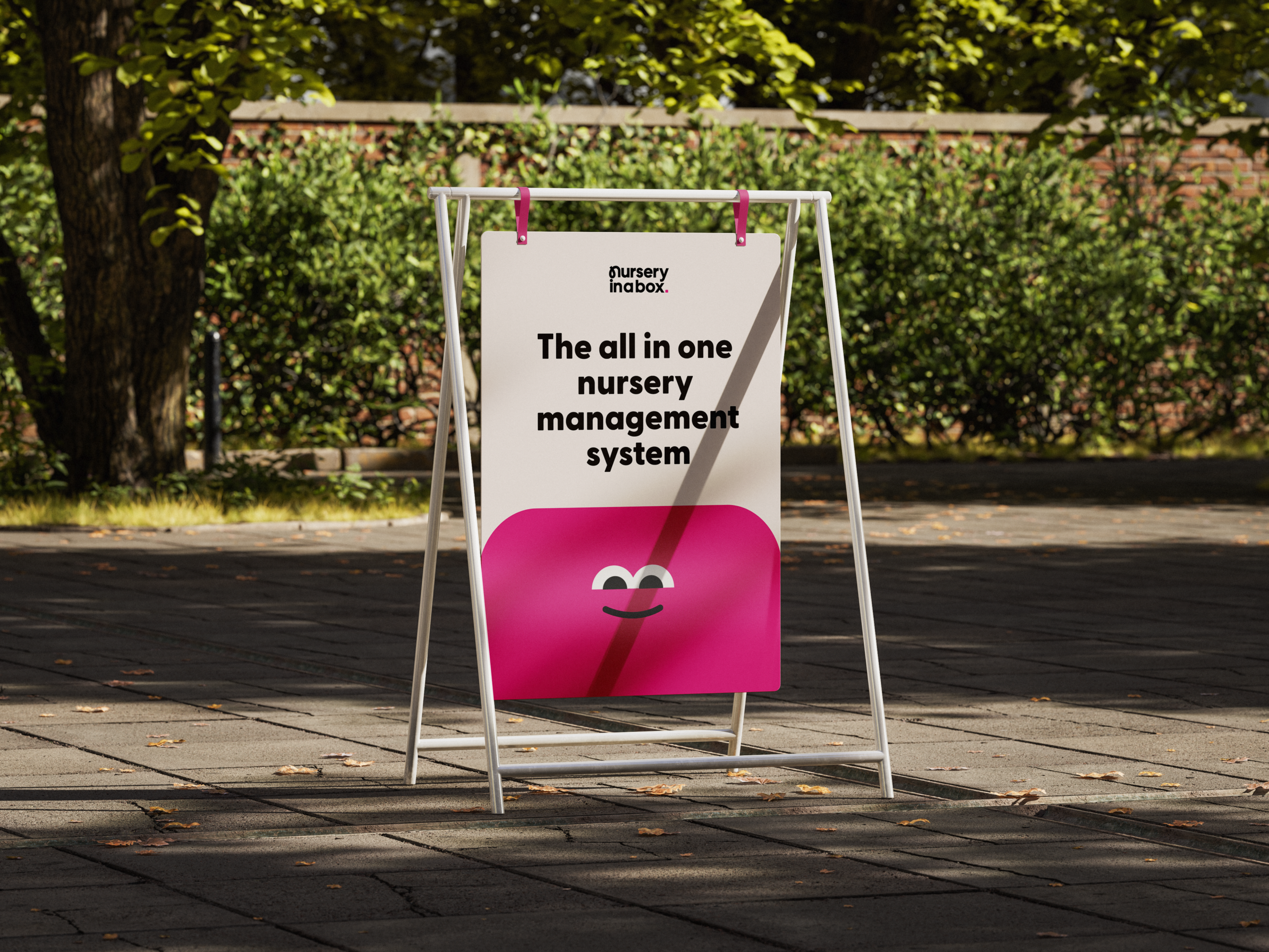
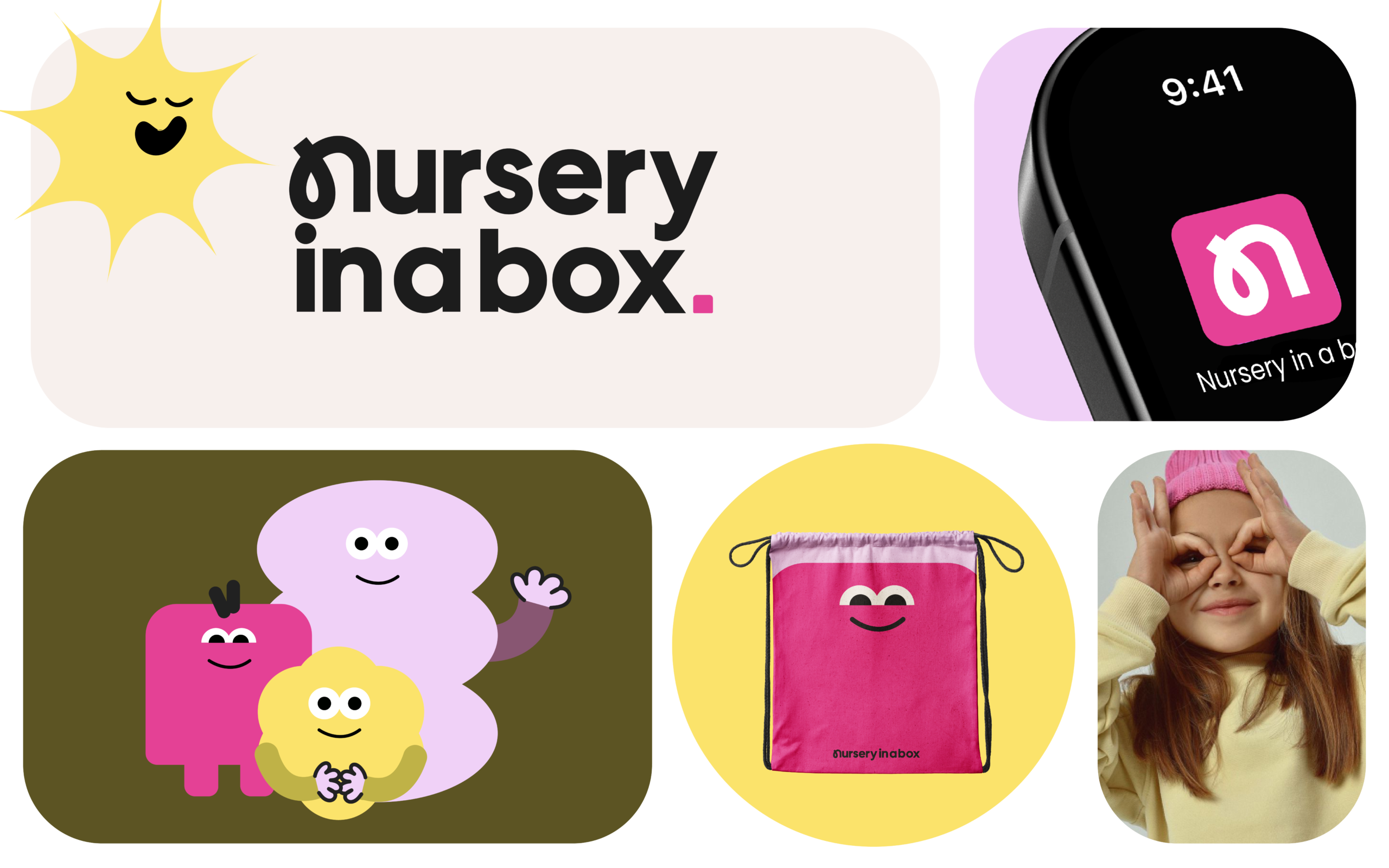
To embody the value of Empathy, we designed a suite of friendly and approachable character illustrations which are super simple by design. Non-complex and non-intimidating, instantly signaling trust and making every touchpoint – from the app interface to marketing, feel more human. These unique characters are used as core narrative devices across all brand touchpoints, from the website to the app interface. They help visualise complex features and abstract concepts like data security or system setup in a playful, unintimidating way. They tell the story that Nursery in a Box is here to help and simplify, reinforcing the brand promise without being too copy heavy.
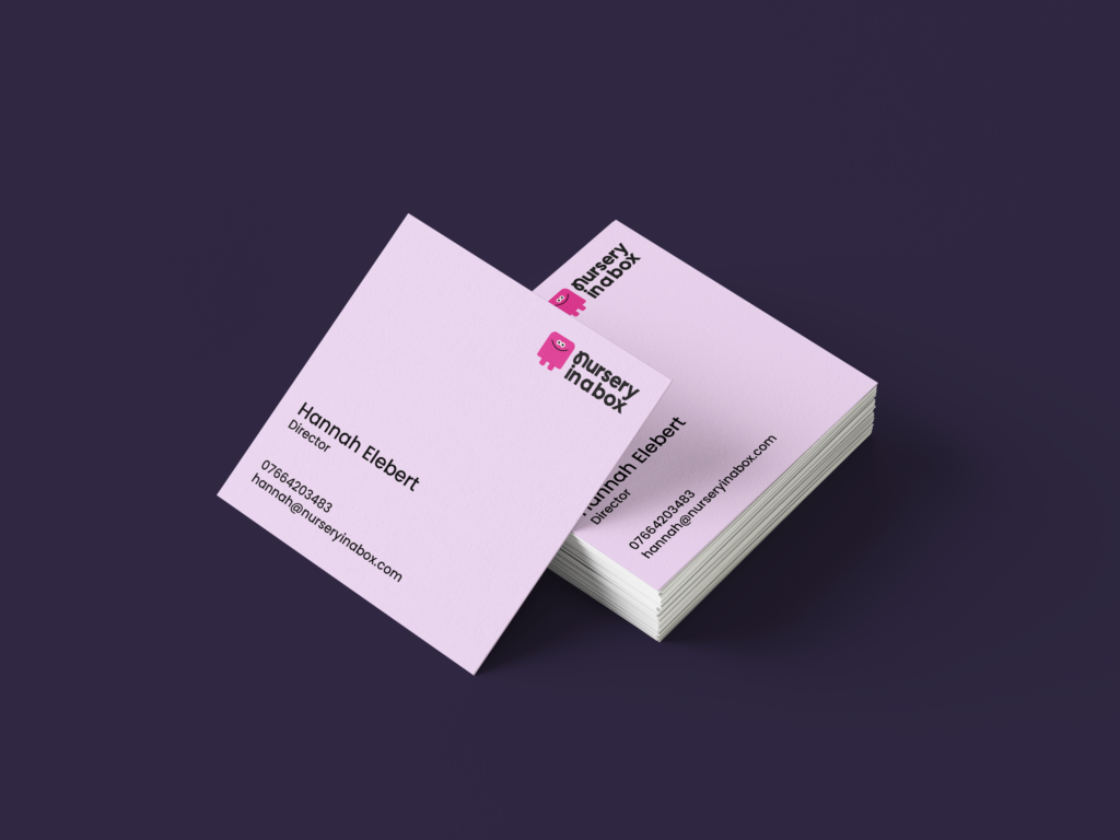
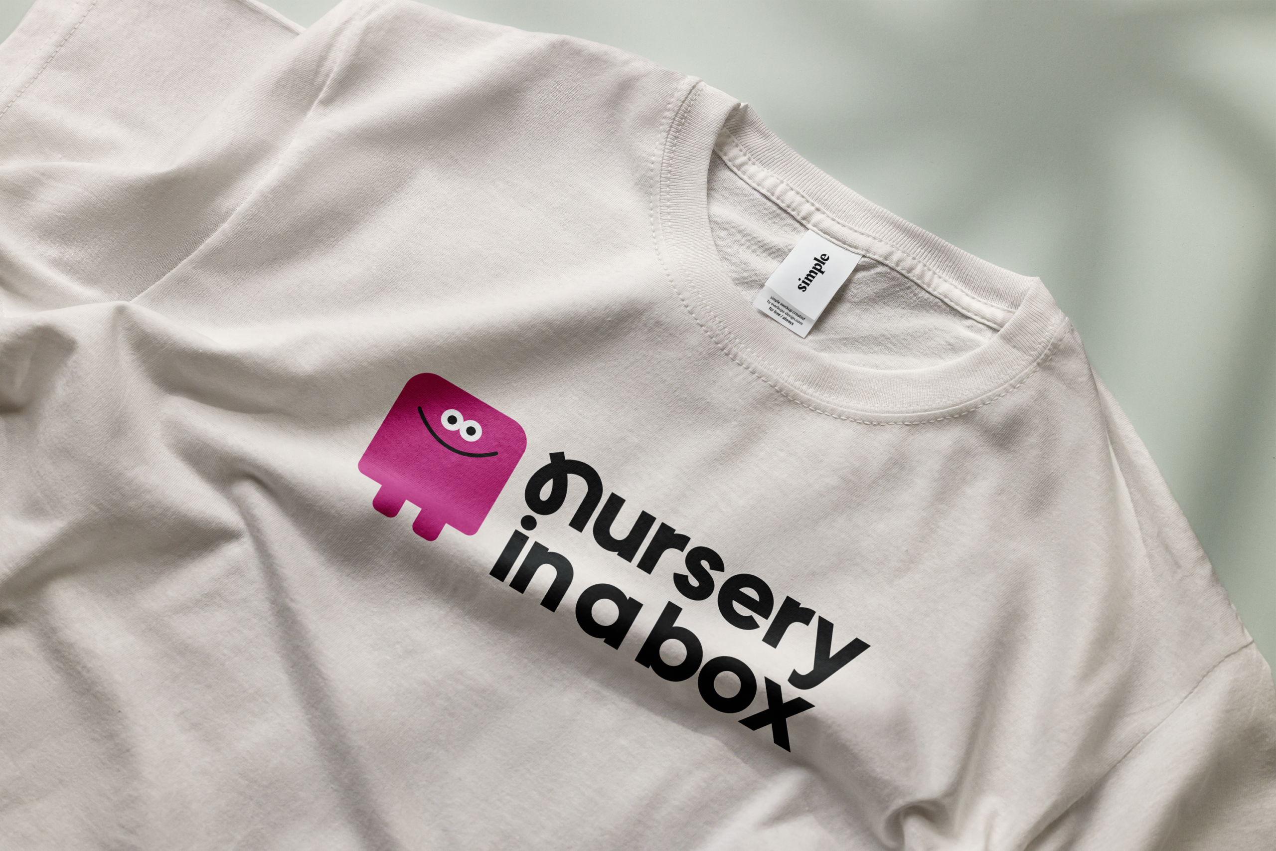
We designed the Nursery in a Box wordmark to communicate immediate warmth and care. This is anchored by a unique typographic detail: the custom ‘n’ in “nursery” is subtly based on the shape of a stork carrying a sack.
This friendly nod to a classic childcare motif anchors the brand in tradition and nurturing, instantly signaling that the system is built with empathy.
